Typography
 A user's first impression of a document is critical. Typography is a powerful tool to influence this perception. Writers should choose typography carefully to increase readability and understanding.
Increasing Readability
Designing print materials universally means having material that everyone can read. Since print is a fixed medium (meaning it cannot be made larger or smaller), writers must use fonts that are visually comfortable. Here are some ways to increase readability according to Kathryn Riley and Jo Mackiewicz in Visual Composing: Document Design for Print and Digital Media:
- Use an appropriate font and font size for headings and body text depending on the project. For most projects, headings should be larger or bolder than body text to help them stand out. This helps guide the reader through the text, giving them chunks of information to take in.
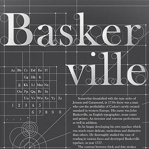
- Use serif fonts in print because they are easiest to read. They give the reader's eye something to follow along the baseline of text from one letter to the next.
- Utilize simple fonts for body text. Display or handwritten fonts are often appropriate for headings, but not usually for body text. One exception to this could be using handwritten text for a wedding invitation.
- Size written material at at least 14pt since users cannot increase font size in print documents. This helps users with visual impairments. This is larger than most print documents are written, but designing it this way means people are less likely to need assistive devices.
- Consider the use of leading (the amount of blank space between lines of text) and how it could ease readers through a text. Riley and Mackiewicz recommend 12 points of leading to increase readability.
Increasing Understanding
Writers should never create material that is understandable but obstructed by a distracting design. Above all, universally designed material should be as clear as possible for all audiences. Therefore, writers should choose a font style that moves readers towards a more thorough understanding of the text. Font styles can also set the tone of a document, and if the tone contradicts the message, it can confuse readers. Here are a couple of suggestions for how to use fonts to increase understanding:
- Fonts have anatomical features that make them either professional, friendly, or somewhere in between. Use fonts that work with the canvas you choose to print on. Just as the canvas you choose to present material helps create a persona, the font you use on the canvas can add to or detract from your desired persona. Staying consistent will help all readers understand your message.
- For example, using a friendly font like Comic Sans would be inappropriate for a notice of eviction or a medical billing statement. On the other end of the spectrum, a bold font like Impact on a wedding invitation could confuse people.